Wednesday, September 29, 2010
I n h a b i t
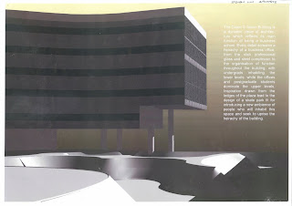
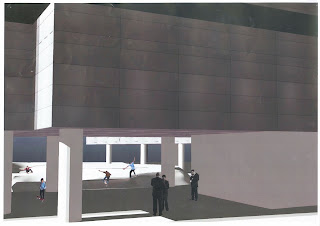
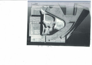
Inhabit was a project which preached the importance of the people within a space and the interactions they had with the environment. Highly noticeable was the hierachy of the building, reflecting the true identity of a corporate business. Undergraduates restricted to lower levels, while postgraduates and office spaces dominated the majority of upper levels. Ledges in the John Hood plaza led to the inspiration of a skate park intervention within the plaza of the building which carved its own identity into both the fisher and paykel building, as well as the owen g glenn. Its purpose to disrupt the major population of business and commerce students and staff, was paired with the intention to integrate a new ambience of inhabitants that would interact with the building. The fluid forms trying to mimic that of the Owen G Glenn building's facade as well as the major "islands" are reflective of the forms of the lecture theaters below; in a sense, releasing a bold statement and bringing attention to the undermined undergraduates' realm below. Slits in the concrete skating arena, allow thin shafts of light to penetrate the Earthly barrier, and into the domain below, the shadows of skaters hopefully inducing reactions and interactions with people below. This introduction of a new movement, both literal and figurative, illustrates a whole new way of inhabiting this space, potentially allowing access through to lectures via skateboarding, as well as the implications to the current inhabitants who are now forced to co-exist with a new breed of people. This intended upheaval of hierachy and disruption is a chaotic challenge to inhabitants' ideas of this space, and experiments with how inhabitants must reform and react to an intervention of architecture.
Threshold Project: A very late post.
Threshold design was based on inspiration from the reading, where the project sought to interpret a new level of communication, that was achieved during carnival where all hierachy was dismissed. The definition of a "threshold" is translated into a kinetic source of architecture which moves to mold the space that occupies both the interior and exterior of the studios and courtyard respectively. The threshold is designed to replace the studio walls, modeling into whatever shape is desired for functionality. Passageways between studio and courtyard integrate subtly into the new facade of the building, a sense of connection established at certain instants before being swallowed back into the mainstream wall, reflecting the temporary nature of the carnival. A flowing facade, variable to change in form, structure and functionality seeks to exemplify the carnival character in the form a threshold.
Sunday, August 8, 2010
Where it all started
Tuesday, August 3, 2010
Final is not so final
Just dragged the structure through into a space where it connects with others. A few tweaks here and there, like adding an apple at the top, signifying a beginning idea, where when something or someone says boom, apples drop from the big apple, and start rolling through the maze. I've connected to someone, by making their part of the circuit fire a rocket that hits a ball i scripted with a collision script. and it says boom. and then apples drop! To start my part of the entire scheme. Also added a mold made from 3Ds max that guides the balls, making sure they dont go completly crazy and fly everywhere. The molds have been set to a transparent texture so as we can still observe the structure.
Chocolate is in the air
Twiddling around again, this virtual concept of a maze seems to be getting more and more vertical. Experimenting with effects of it being within the air, looks more like an interruption of space. Also tried different arrangements trying to test the potential of this vertical virtual maze. Also kept the rotation scripts and changed the timers on each one to create a more of a randomness and insecurity in when each wall would turn and allow passage. Reflects the uncertain nature of an idea forming, and also the development of an idea. Started thinking of speed the ball passes through and all sorts, so i decided to alter lengths and also direction of rotation to create more of a visually stimulating virtual maze. Also changed texture by selecting all the maze walls and changing the texture together, creating a structure that kind of expresses different sides to it and other opportunities randomly throughout it.
Be my friend, 3Ds Max
Just playing around with 3Ds max. Finding trouble importing it in, as when it does, the form isnt exactly what I drew in 3Ds max. Made some hedge-like components to keep with the theme of mazes but I thought they didn't look aesthetically stimulating enough. I moved on to experiment with blocks again, with different textures.
Subscribe to:
Posts (Atom)